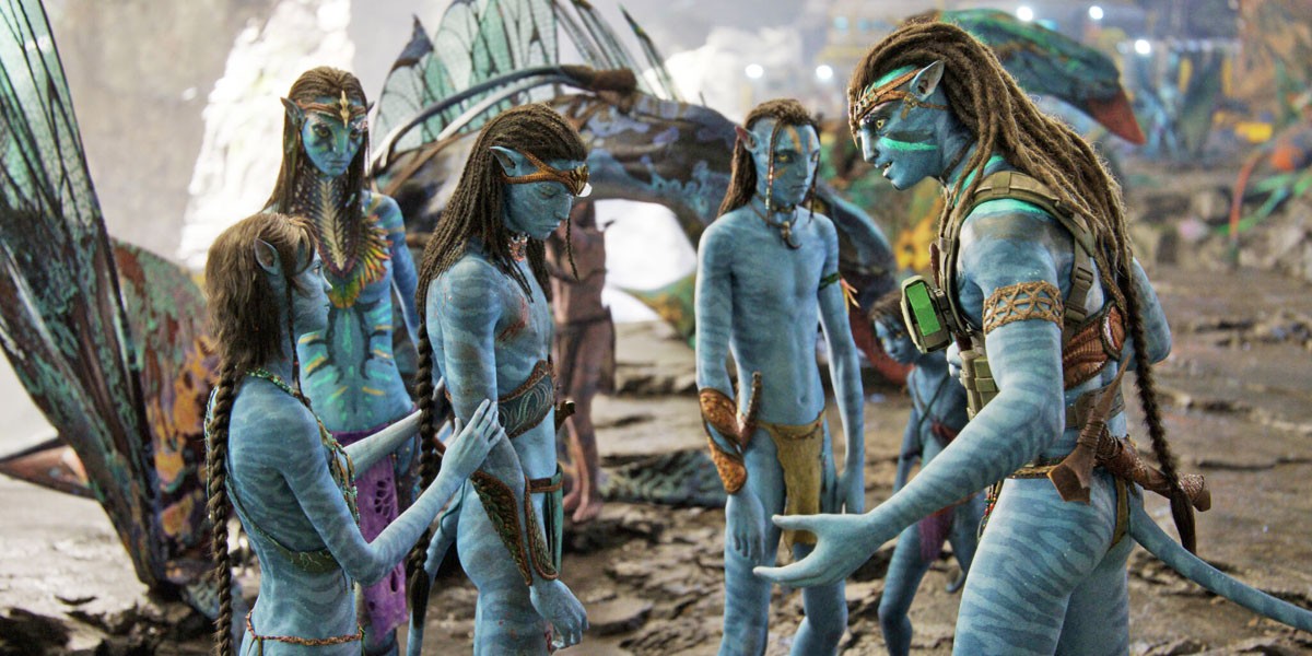
James Cameron’s Avatar is undoubtedly a cinematic masterpiece, and the film earning the title of the highest-grossing movie all of time is a very conspicuous testament to the same. However, the filmmaker believes the 2009 movie would have been able to bring in much more money than $2.9 billion, if only it wouldn’t have been for the whole font fiasco.
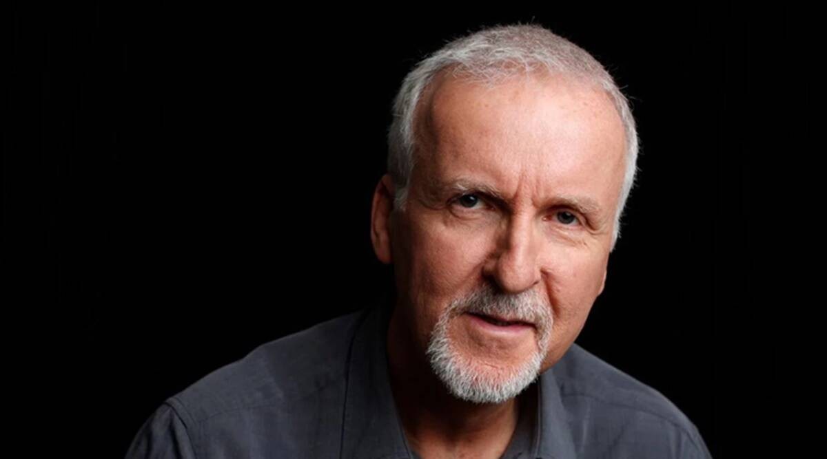
In one of his recent interviews, the 68-year-old director addressed the subject about using Papyrus for the poster of Avatar, admitting that the film would have most probably grossed in a much higher number if they’d chosen a different font instead.

At the same time though, he seems to be quite nonchalant about it all from a more general perspective and is otherwise content with his decision.
Related: With a Reported $400M Budget, Avatar: The Way of Water Could Be the Most Expensive Movie Ever Made
James Cameron Talks About Using Papyrus Font for Avatar
In a conversation about his upcoming sequel to the sci-fi/adventure film, Avatar: The Way of Water, with Empire, James Cameron was asked to share his two cents on the Saturday Night Live font sketch ridiculing his choice of font for Avatar (2009). And contrary to public opinion, the Canadian filmmaker was actually not all that bothered about choosing Papyrus for the first film’s poster, claiming that he even liked the font.

“Just think of how much we could have grossed if it wasn’t for that damn font. I was not aware that our font was an off-the-shelf thing; I assumed the art department or the title company came up with it. Of course, it was trolled mercilessly as a lazy choice, but frankly, I like the font. Ryan Gosling needs to get out more, instead of freaking out over our font. Time to move out of your mom’s basement, Ryan! And if Papyrus resonates with the issues of Indigenous cultures in the public consciousness, then that fits well with ‘Avatar,’ so I’m not losing any sleep over it.”
The SNL font sketch made it to the forty third season of the comedy series, with The Notebook actor Ryan Gosling as the star in thee three-minute sketch, wherein he briefly mocked the use of Papyrus for Avatar‘s main logo and poster. But it was definitely funny, especially since it’s managed to get a good laugh out of Cameron himself.
Why James Cameron Wasn’t Worried About Avatar‘s Font Style
Cameron certainly seems to be just as amused as his audience about the whole situation, especially with regard to SNL’s hilarious sketch. But at the same time, he’s also a bit defensive about his decision of the font style, because of its symbolization of the Indigenous culture that he has presented in the movie.

But even though he is ready to defend the use of Papyrus for the first movie, as far as Avatar 2 is concerned, the graphic designer crew seems to have ensured that the same mistake doesn’t get repeated with the sequel, and have chosen a completely new font altogether for the poster.
Sure, the first film would have made more money without the hindrance that this font issue posed, but as the True Lies director remarked, it isn’t something to “lose any sleep over.” After all, what are a few more millions to someone whose film has already grossed the most in cinema history.
Avatar: The Way of Water is scheduled to premiere on December 16, 2022.
Source: Screen Rant


